Ice Core Illusions
Let's talk about dating

To the public, an ice core graph looks like an objective recording of time. Smooth curves rise and fall across millennia. Temperature variations appear as gentle waves, based on the assumption that climate changes slowly, predictably, mechanically.
In reality, the ice core graph is a mathematical sculpture.
To maintain the “Stable Calendar” and the 41,000-year orbital cycle, mainstream science transforms catastrophe into gradualism — a scream into a whisper.
Here is exactly how a sudden, high-energy event is removed from the record and turned into a “slow climate trend.”
1. The Raw Witness: The 10-Meter “Flash-Ice” Spike
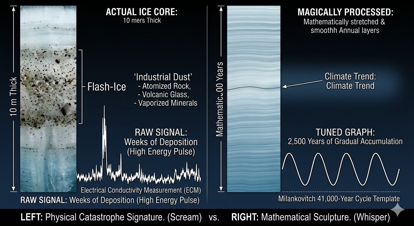
Consider a section of ice from the “Deep-Cold” Node alleged to have occured 20,000 years ago. In the laboratory, the Electrical Conductivity Measurement (ECM) and Dust Concentration scans show a massive, jagged spike.
What the Raw Signal Reveals
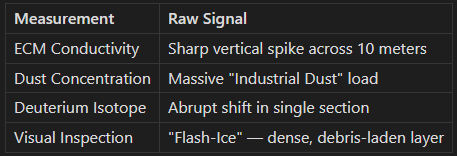
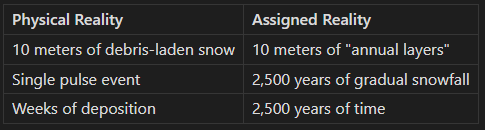
The Physical Reality: This 10-meter section is packed with “Industrial Dust” — atomized rock, volcanic glass, and vaporized minerals. It represents a Single Energy Pulse — perhaps a few weeks of atmospheric collapse that dumped a massive “snow-and-debris” load onto the ice sheet.
What the Raw Signal Would Mean
If interpreted literally:
10 meters of ice accumulated rapidly, not millennia
The dust signature indicates planetary-scale atmospheric disruption
The ECM spike indicates electrical discharge through the atmosphere
The entire “20,000-year” interval could be compressed into a single catastrophe season
The “LGM” Dust Wall
In deep Antarctic cores like Vostok and EPICA Dome C, there is a massive feature known as the Last Glacial Maximum (LGM) Dust Peak (roughly corresponding to 20k–23k BP node).
The Scale: In the raw depth, this isn’t a “point.” It is a sustained, high-concentration zone of insoluble mineral dust. In some cores, the “dusty” ice spans a significant vertical distance (meters) where the concentration is 20 to 50 times higher than the surrounding ice.
The Signature: The dust isn’t just “sand.” It is Aluminosilicate—microscopic, sharp-edged particles of continental crust. It represents the planetary-scale machining of the continents.
The Manipulation: On a standard chart, these meters of dust are labeled as “10,000 years of aridity.” But if you look at the Electrical Conductivity (ECM), the spikes are vertical. They indicate that the “Dust Wall” was deposited in a series of violent, rapid events, not a slow, steady trickle.
2. “Orbital Tuning” (Stretching Time)
The scientist cannot allow 10 meters of ice to represent only two weeks. If they did, the 41,000-year cycle would be ruined.
The Procedure
Orbital Tuning applies a Depth-to-Age Model based on the Milankovitch calculations. The scientist looks at the pre-calculated orbital math (the “Wobble”) and forces the ice core data to match.
The Manipulation
They declare that these 10 meters of “Flash-Ice” actually represent 2,500 years of slow, steady accumulation.
The Result
A catastrophe that took weeks to deposit is now spread across two and a half millennia of imaginary time. The energy signature — the violence of the event — is diluted across an interval where it becomes just another gradual fluctuation.
The Circular Logic
The orbital tuning assumes:
The Milankovitch cycles are real
The 41,000-year periodicity is genuine
The ice accumulated steadily over time
But these assumptions are calibrated using the ice cores themselves. The circularity is complete: the ice proves the orbit, and the orbit interprets the ice.
3. “Gaussian Smoothing” (Erasing the Snap)
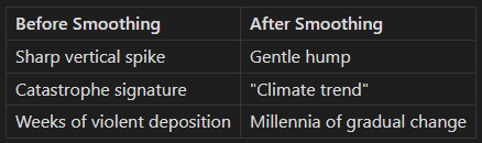
Even after stretching the time, the data is still “too spiky.” It looks “unstable.” The raw measurements show sharp vertical transitions that contradict the Uniformitarian model of slow, gradual change.
The Procedure
They apply a Low-Pass Filter or “Gaussian Smoothing” — a mathematical tool that averages each data point with the points around it.
The Manipulation
This mathematical operation takes the sharp, vertical needles of the raw data and spreads them into the “quiet” years around them. The spike’s amplitude is reduced; its width is increased.
The Result
The jagged spike — the evidence of a high-voltage discharge, a planetary reset, a Living Sky event — is flattened into a long, gentle, “warm-to-cold” hump that fits comfortably within the Uniformitarian narrative.
The evidence of catastrophe is mathematically averaged into invisibility.
4. The Final Report: The “Climate Trend”
The Public Narrative
What was once a 2-week catastrophe is now presented on the news as:
“A 2,500-year gradual cooling trend caused by orbital tilt.”
The graph shows a smooth curve. The press release mentions “orbital forcing.” The public sees stability — a predictable, mechanical Earth that changes slowly over thousands of years.
The Hidden Reality
Beneath the smoothing, beneath the tuning, the raw signal still exists in the archived data. The spike. The dust. The conductivity anomaly. The evidence of catastrophe is there — but only for those who know how to look.
The Political Utility
This creates the illusion of a predictable, mechanical Earth. It allows “Climate Alarmists” to claim that our current 150 years of data are “unprecedented,” simply because they have mathematically erased the precedents of the past.
The catastrophes of the past are hidden behind the smooth curves of processed data. The public sees no precedent because the precedents have been smoothed away.
The Pattern Recognition
Other Data Types, Same Procedure
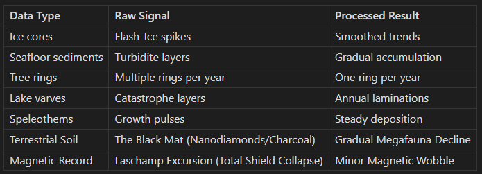
The same smoothing, tuning, and averaging procedures are applied across all paleoclimate proxies. Each dataset is processed to fit the Uniformitarian timeline. Each catastrophe signature is averaged into a gradual trend.
The Convergence Illusion
Scientists cite the convergence of different methods as proof of accuracy. “Ice cores, marine sediments, and tree rings all agree!”
But if all methods are tuned to the same orbital timeline, and all are smoothed with the same assumptions, then convergence proves only consistency — not correctness. The methods agree because they are processed to agree.